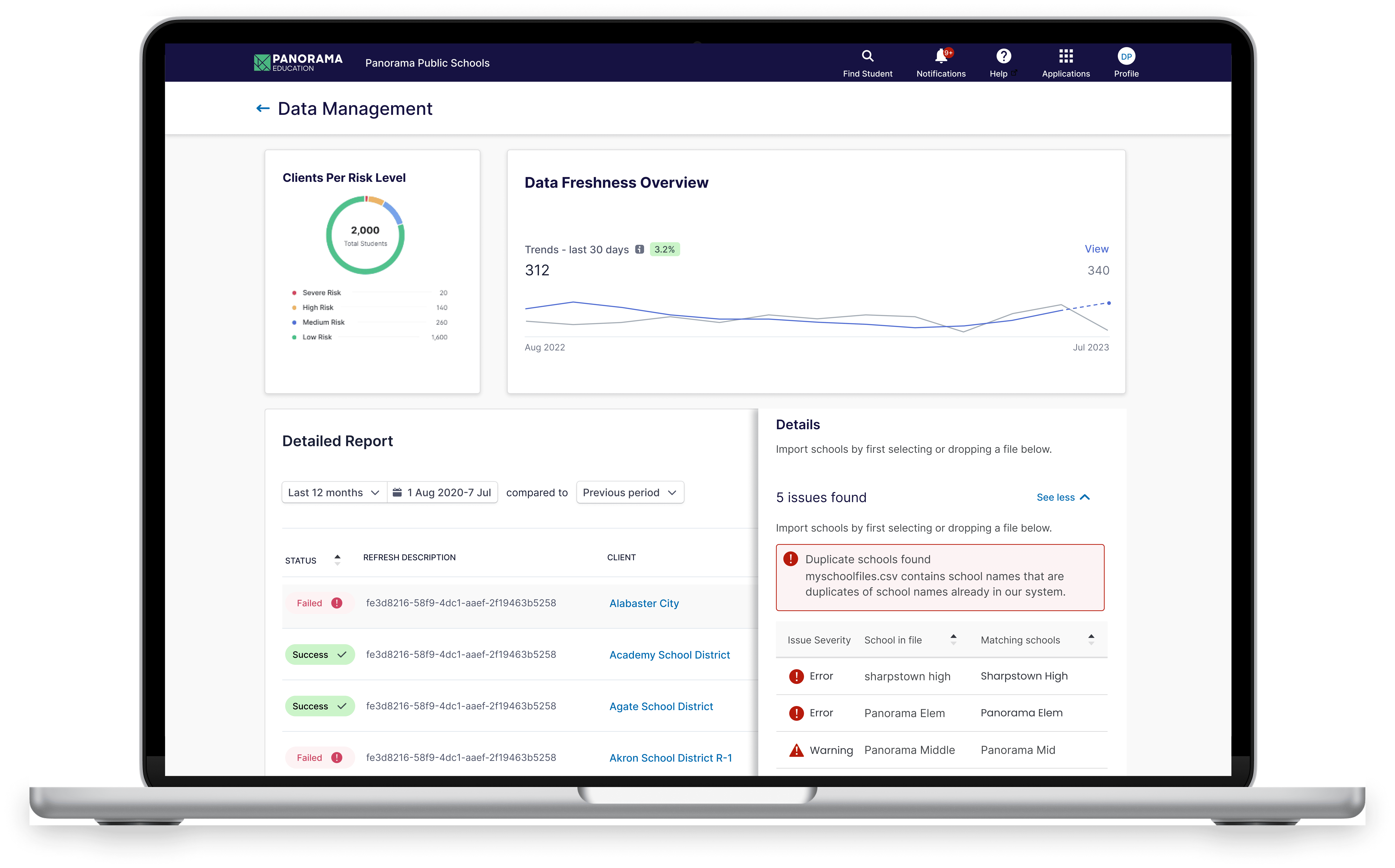
Description
Project Overview
Our engineers were struggling to manage data ingestion issues within Panorama’s platform. Each night, large volumes of student records, grades, and attendance data were synced through an outdated internal system called Rainbow, which connected to our newer NDS architecture before feeding data to our clients’ platforms. Errors during this sync process were frequent, and engineers were spending 5+ hours daily manually investigating issues.
What Engineers Were Doing
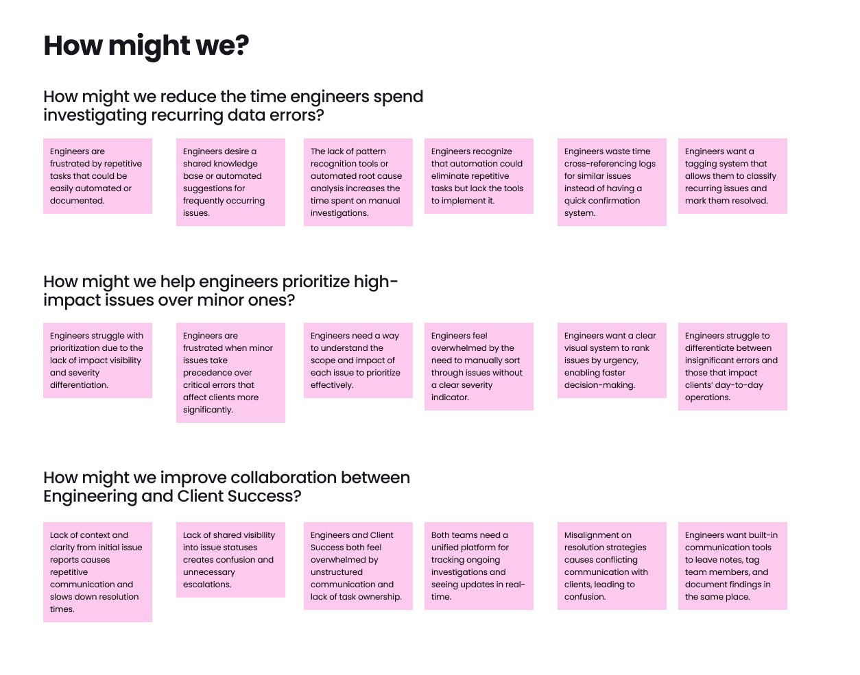
By analyzing the engineers’ workflows, we identified major inefficiencies. Engineers were constantly toggling between SQL databases, raw error logs, and custom scripts in Rainbow to find root causes. They were using makeshift tools and a basic, rudimentary dashboard, which provided no intuitive way to prioritize high-impact errors. This led to wasted time on minor issues, while critical data disruptions affecting multiple clients were sometimes overlooked. The current process didn’t support cross-team visibility, which resulted in miscommunication with Client Success.
Why They Were Struggling
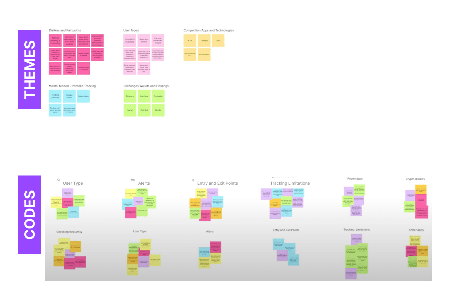
To better understand the pain points, we conducted 7 interviews and 3 contextual inquiries with engineers and Client Success Managers. Engineers felt overwhelmed by repetitive investigations and frustrated by the lack of prioritization tools. Common minor issues—such as missing headers or misaligned data fields—took just as long to resolve as complex errors because they had to go through the same investigation flow for each problem. Client Success Managers, on the other hand, were in the dark, with no visibility into which issues were being addressed. This lack of transparency led to unnecessary escalations and constant pings for updates.
“I feel like I’m doing the same job every day, fixing the same problems over and over, but I can’t even see if my work is making a difference.” Meanwhile, Client Success felt frustrated: “We never know which issues are actually being worked on, so we end up escalating everything just to be safe.”
- Data Management Engineer
Brainstorming Solutions
Next, I led a series of brainstorming workshops with engineers, designers, and product managers. We generated over 40 ideas to address these pain points, focusing on automation, prioritization, and collaboration. Ideas ranged from automated tagging for common errors, to building a shared dashboard that could bridge the gap between Engineering and Client Success, to creating a client-facing tool that would allow tech admins to handle minor issues themselves.
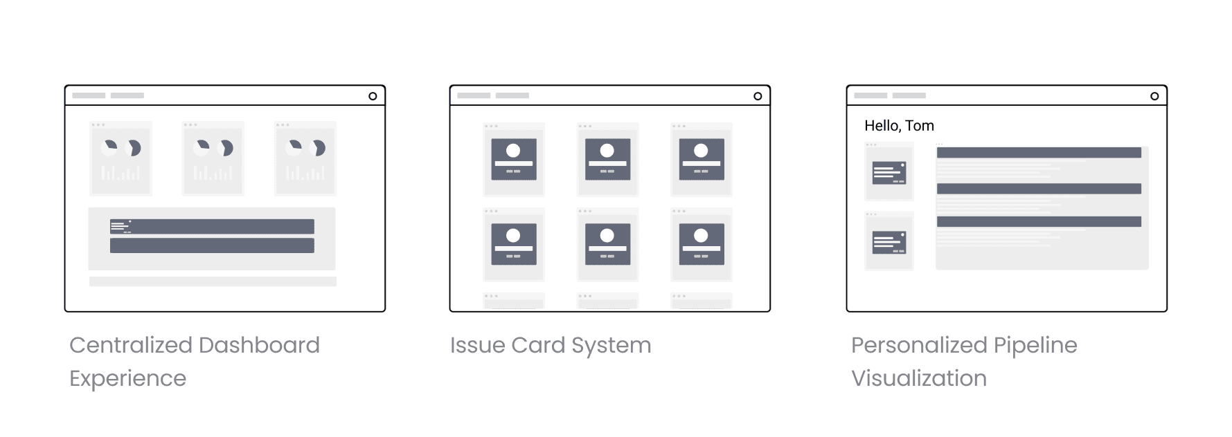
After filtering and refining, we narrowed down to three main concepts:
Pipeline Visualization Tool — mapping the entire sync flow visually.
Issue Card System — representing each error as an individual card for better categorization.
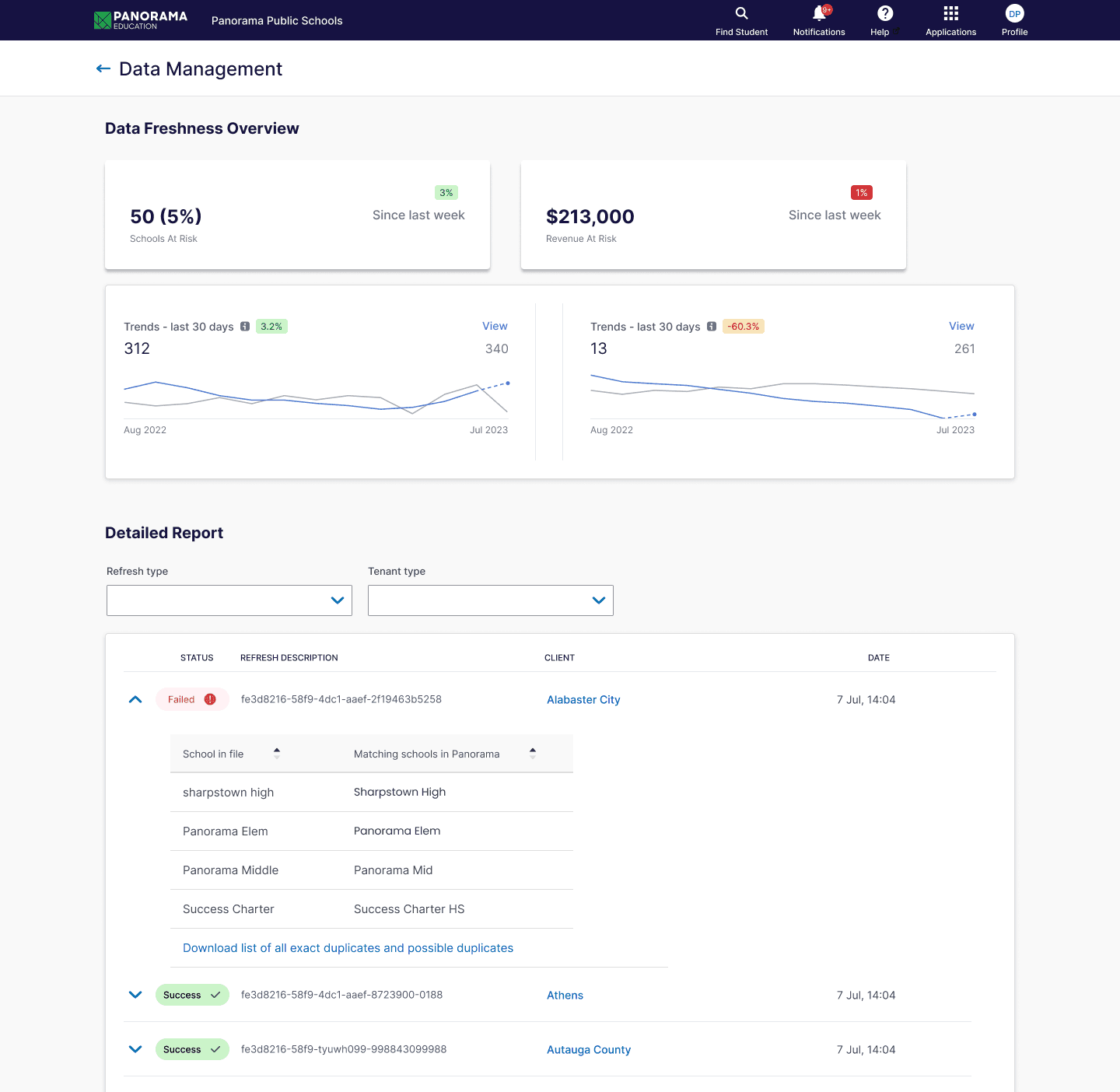
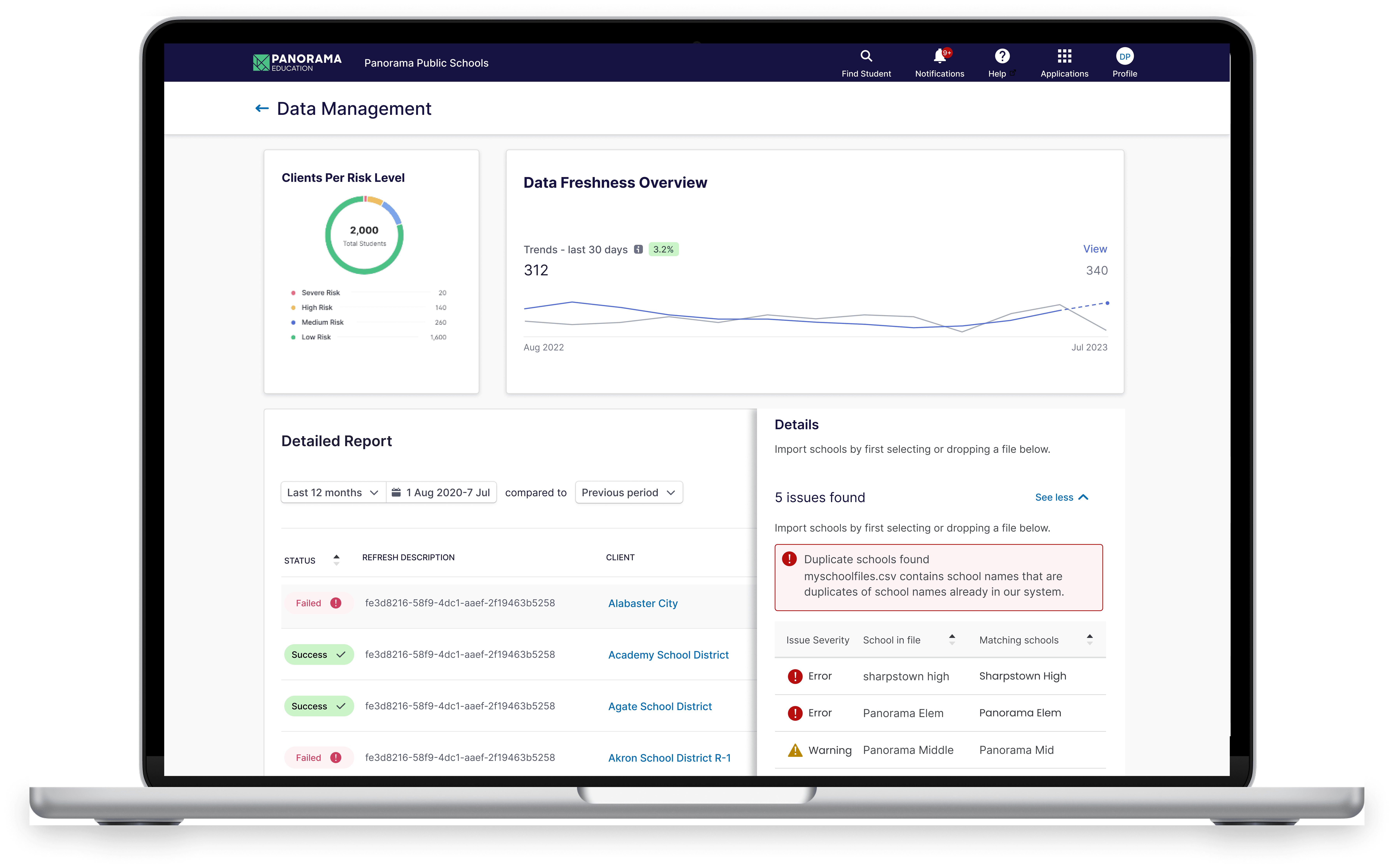
Centralized Data Table — offering a single view for error tracking, with built-in filters and severity indicators.
Prototyping and Testing
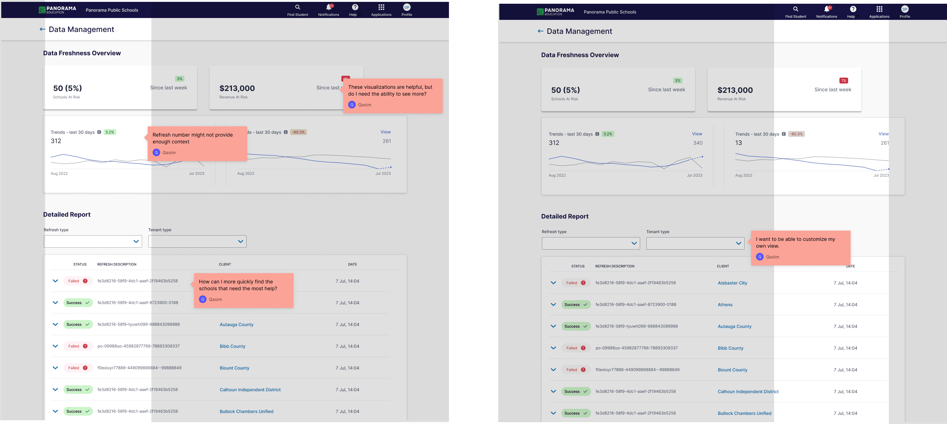
The Centralized Data Table showed the most promise. Engineers liked its straightforward approach, which allowed them to filter by severity, client impact, and error type. Client Success appreciated the built-in commenting feature that enabled them to leave context on escalated issues. We iterated on this concept, adding color-coded severity tags and a tile-based overview panel that showed a quick snapshot of all sync statuses.
User Testing and Iterations
Once we finalized the design, we moved quickly into development. The entire dashboard took 4 weeks to build, given the need to create custom components from scratch, including the robust data table. After launching, we conducted a series of A/B tests to measure its impact on engineering efficiency.
Final Design
Once we finalized the design, we moved quickly into development. The entire dashboard took 6 months to build, given the need to create custom components from scratch, including the robust data table. After launching, we conducted a series of A/B tests to measure its impact on engineering efficiency.
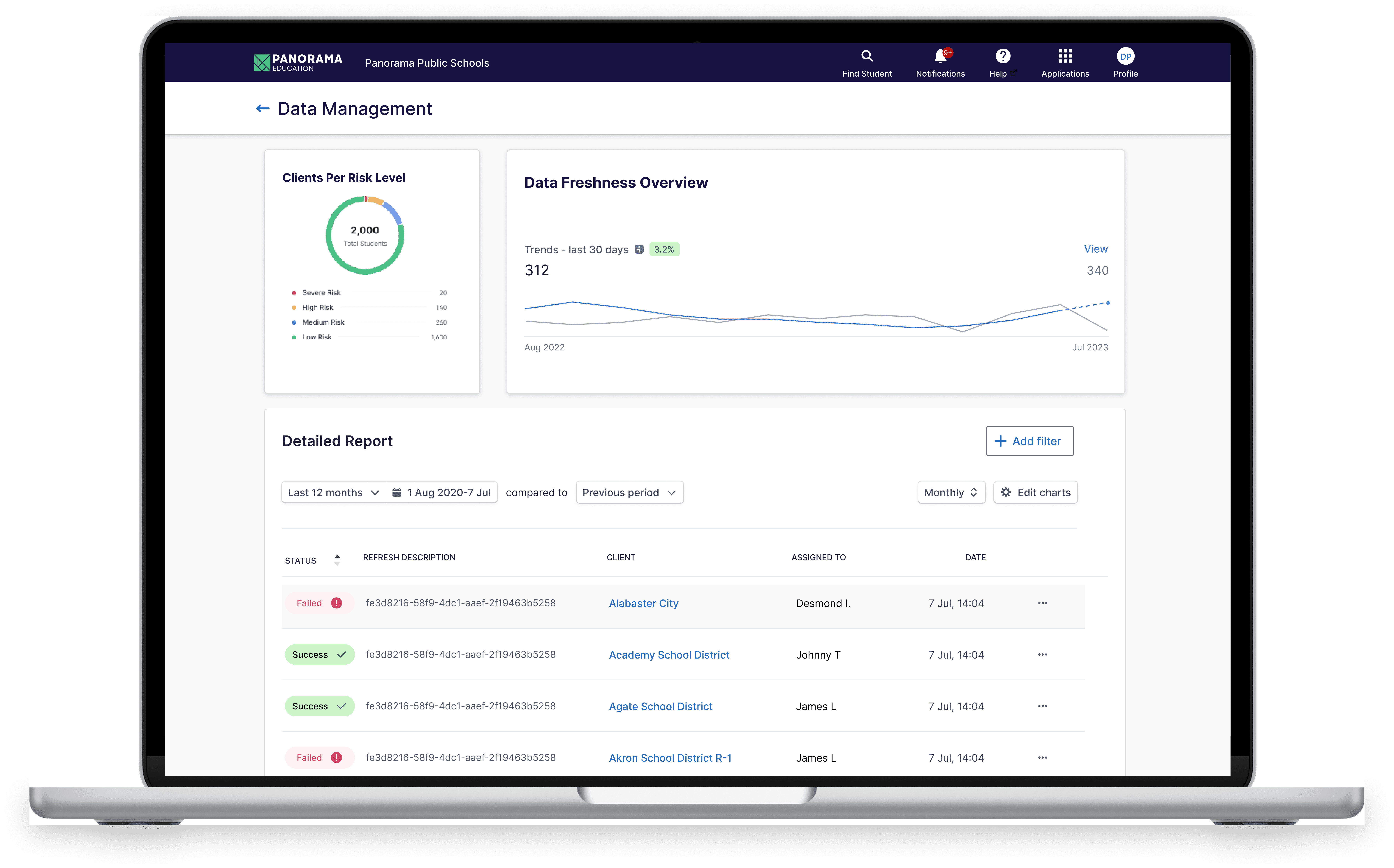
Our final solution gave engineers a clearer view of high-priority issues, better collaboration tools, and reduced manual work, ultimately boosting their efficiency and allowing them to focus on impactful projects.
Building and Measuring Impact
Once we finalized the design, we moved quickly into development. The entire dashboard took 4 weeks to build, given the need to create custom components from scratch, including the robust data table. After launching, we conducted a series of A/B tests to measure its impact on engineering efficiency.
The results were clear:
51% Reduction in Investigation Time — Engineers went from 4+ hours to less than 2 hours daily, freeing up nearly 200 hours per engineer annually.
27% Faster Resolution Times — Overall critical issues were resolved faster, reducing client disruptions and enhancing data quality.
